Charts
Charts serve as the core component of the AHF Global Dashboard application. This section of the documentation intends to enlighten users on functional aspects of various charts used in data visualization.
Description Details
Each chart includes a blue i icon on its rightmost bottom that is intended to provide a brief description of the data represented by the chart. Clicking the i icon renders a tooltip that provides details about the data visualized by the respective chart.
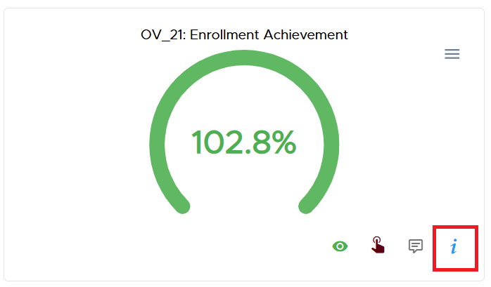
A snippet depicting the information icon on a chart
The i icon turns into an X when the tooltip renders. Clicking the X icon will effectively close the tooltip and the icon reverts to the initial i icon.
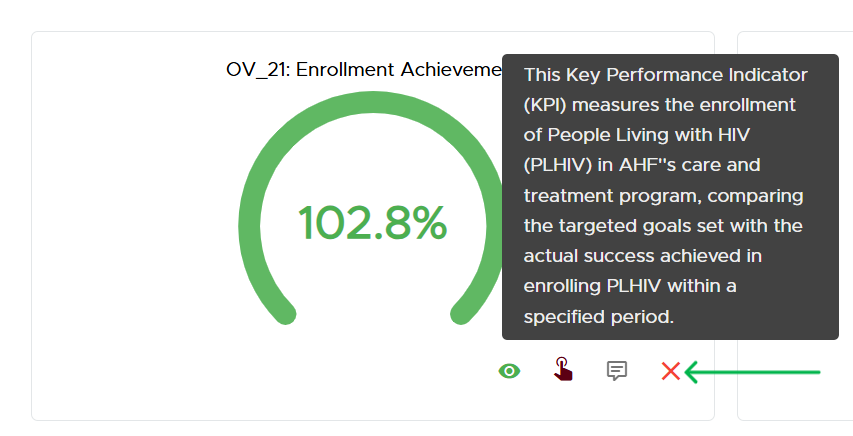
A snippet depicting the description tooltip
Chart Feedback
Each chart includes an option for submitting feedback specific to it from users. The message-like icon next to the i icon should be clicked to render the feedback dialog that accepts user feedback for the respective chart.
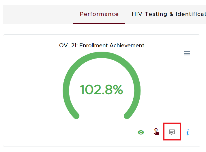
A snippet depicting the feedback icon on a chart
The feedback dialog presents the users with a text-area to provide their feedback as shown below.

A snippet depicting the feedback dialog with the Send button
To submit feedback, click the red send button.
- NOTE:
The input provided for accepting feedback expects users to key in a minimum of 5 words to permit submission.
Drill-Down Interactivity
Some charts enable the visualization of data in phases. For instance, an authenticated user with Bureau level access can first view summary data for their bureau, then individual countries and eventually sites. This approach ensures that the user is not overwhelmed with too much information to process at once. This is the Drill-Down approach.
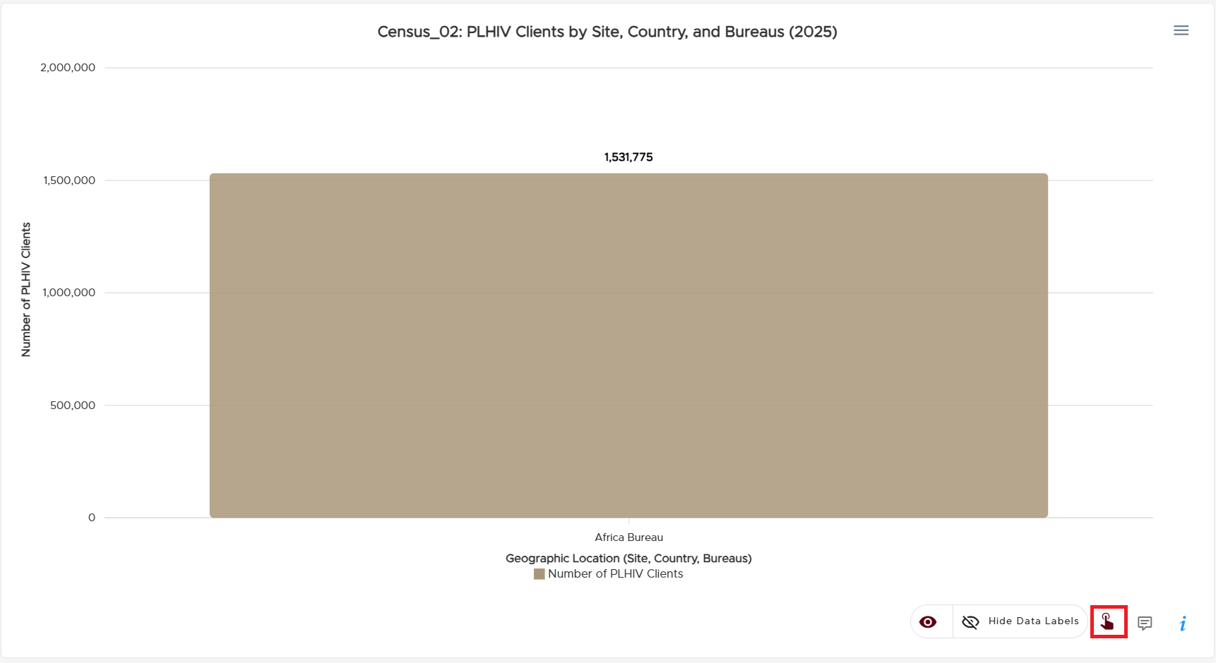
Drill-Down supported charts are distinguished by a red pointing hand gesture icon as evidenced by the image below. Drilling down cannot be done on charts that do not bear the red pointing hand gesture icon.
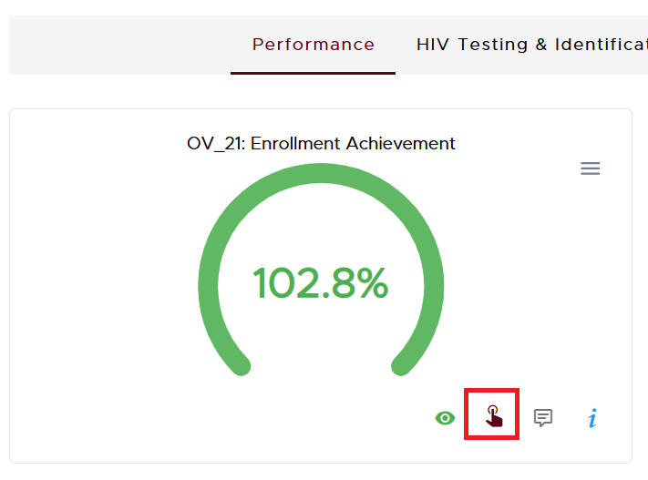
A snippet depicting the Drill-Down icon
To drill down, simply click the visual aspects of the chart eg. arcs or bars. When the cursor is hovered over such visual aspects, they brighten up and can be clicked to provide the next layer of information for visualization.
The following snippets non-exhaustively highlight some charts with Drill-Down functionality.
Gauge Chart
This chart is quite frequent on the Dashboard/Overview page and usually includes a percentage or figure enclosed in a coloured arc.

A snippet depicting an interactive chart
Notice how the green arc is brighter due to the cursor being hovered over it. Clicking this arc would reveal the next layer of data.
Column Chart
This chart is characterized by one or more vertical bars
A snippet depicting an interactive chart
Pie Chart
This type of chart is characterized by a circle which contains sectors indicating various aspects of the data being represented.
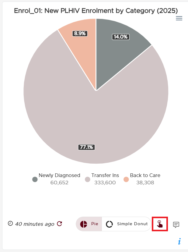
A snippet depicting an interactive Pie chart
Simple Donut Chart
This is a variant of the Pie chart that distinguishes its appearance with a hollow at the centre rather than a complete circle.
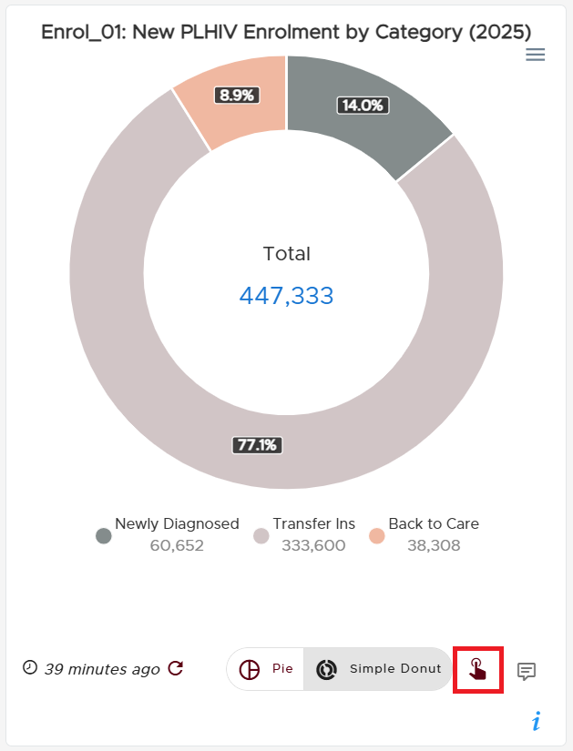
A snippet depicting an interactive Donut chart
Combo Chart
As alluded by its name, this chart is a combination of two charts. It plots data using both bars and a line.
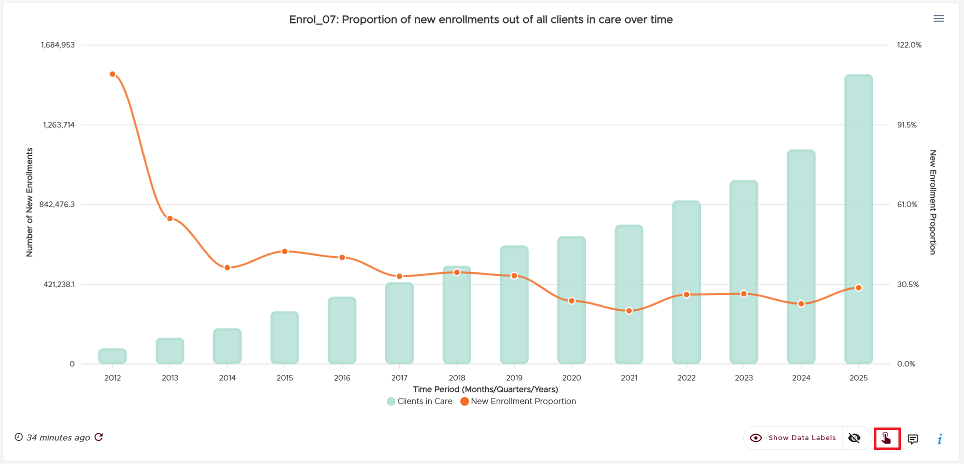
A snippet depicting an interactive Combo chart
Stacked Chart
This chart utilizes vertical bars to visualize different quantities with each quantity bearing a distinct colour. The vertical bars will have varying heights.
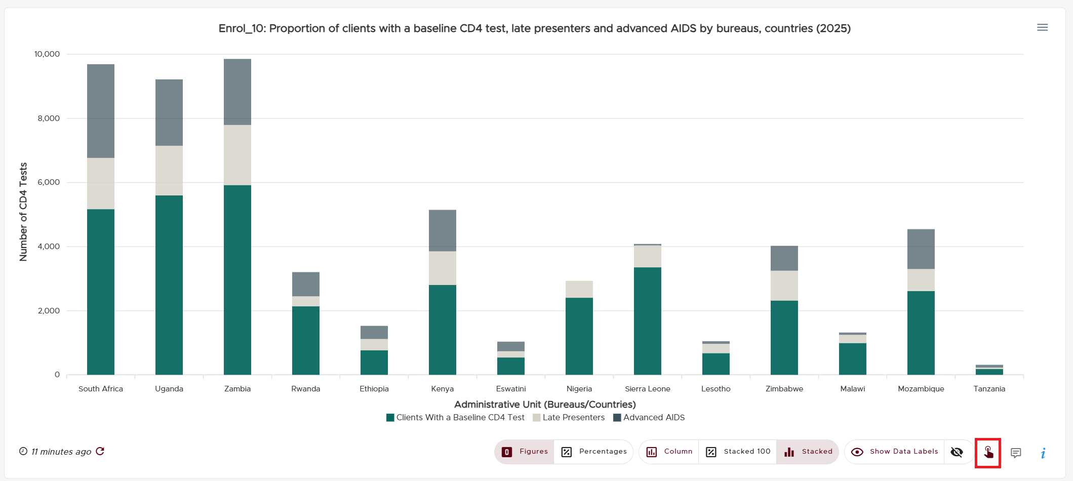
A snippet depicting an interactive Stacked chart
Stacked 100 Chart
Just like the Stacked Chart, this chart utilizes vertical bars to visualize different quantities such that each quantity bears a distinct colour. However, the vertical bars will always take up the entire height of the chart and be the same height in the Stacked 100 chart. Each bar will still correctly depict the respective distinctly colour-coded proportions that it represents.
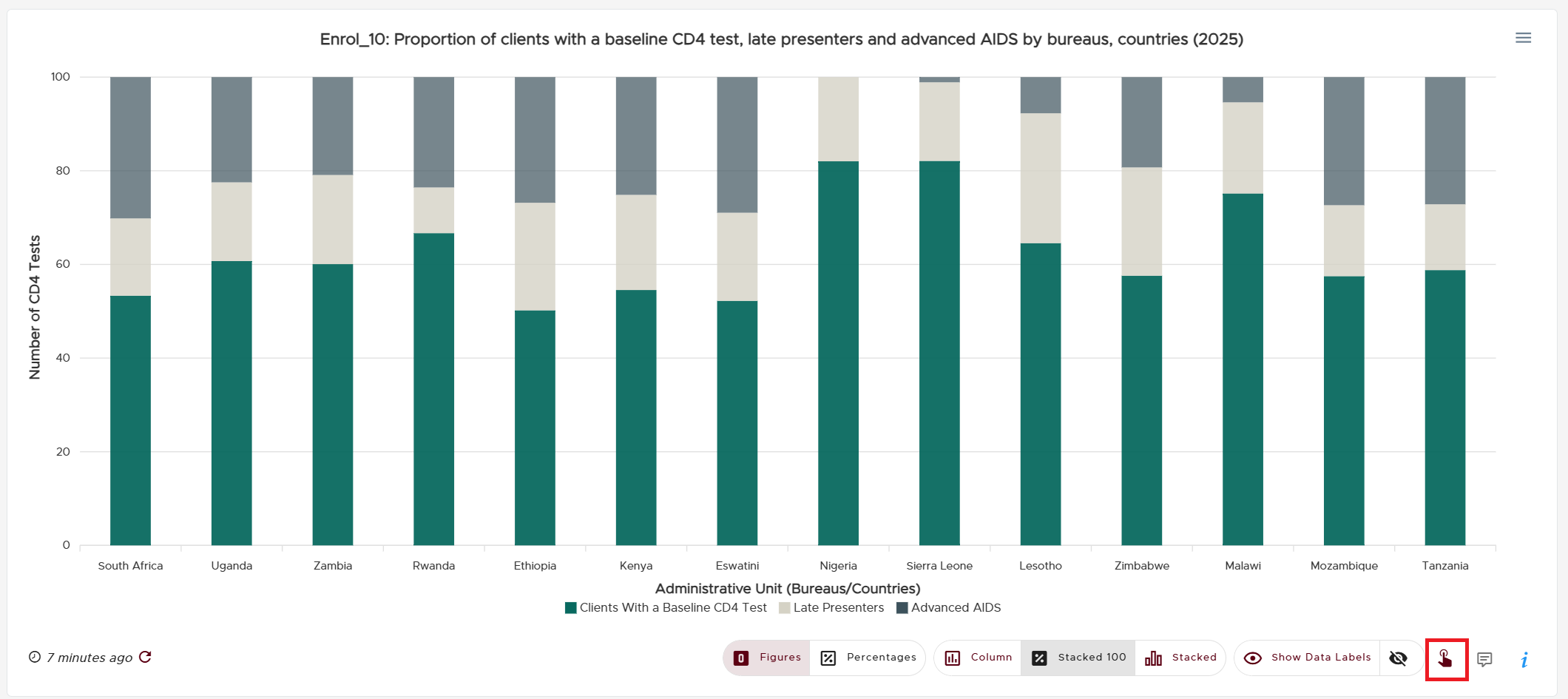
A snippet depicting an interactive Stacked 100 chart
NOTE:
Not all types of charts listed above have Drill-Down functionality by default. Always look out for the red pointing hand gesture icon to the bottom right of a chart to ascertain that it can be drilled down.
The degree to which a Drill-Down can be performed is dependent on the authenticated user’s access level.
Enabling/Disabling Data Labels
Values that are directly rendered on a chart can be enabled or disabled. To achieve this, click the eye icon toggle button located just to the left of the red pointing hand gesture. This toggle button usually contains the text about either showing or hiding the data labels depending on the active language and current visibility state of the labels.
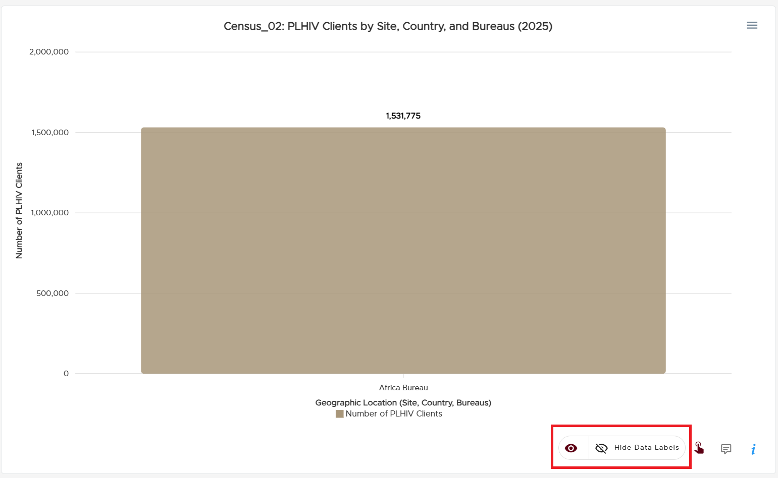
A snippet depicting the show/hide data labels toggle
Multiplicity of Charts
Some data are visualized with more than one chart and the user can toggle between the multiple chart options provided. Below are some examples.
Donut or Pie Chart
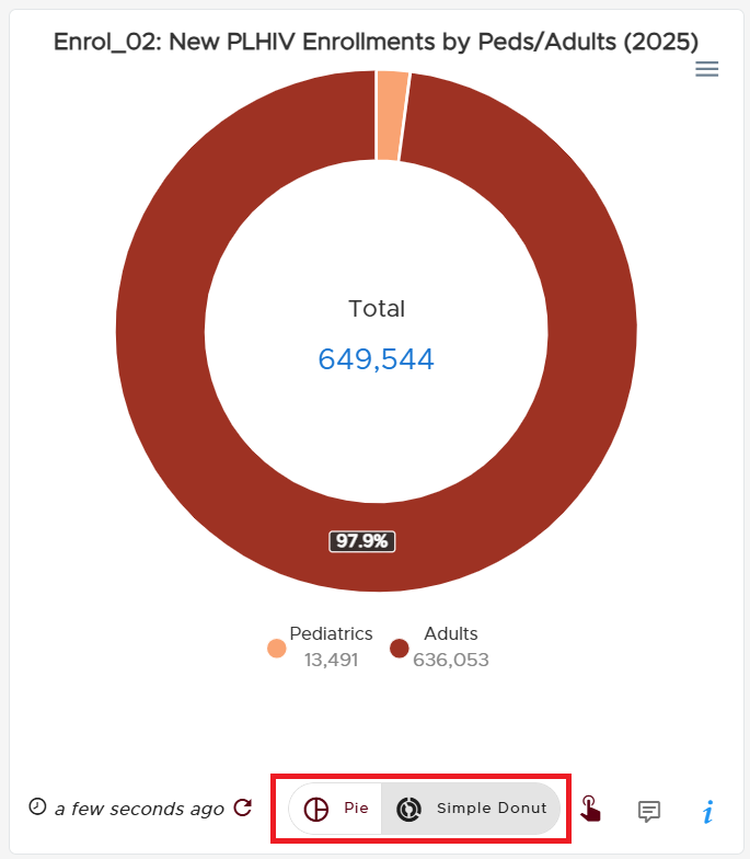
Toggle between Pie & Donut chart
Area or Column Chart
Toggle between Area & Donut chart
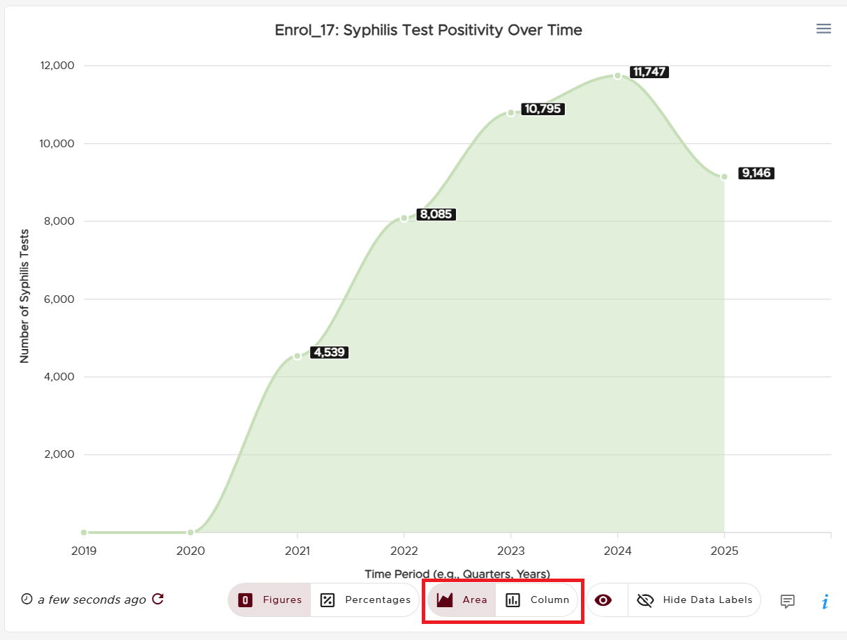
Line, Area or Column Chart
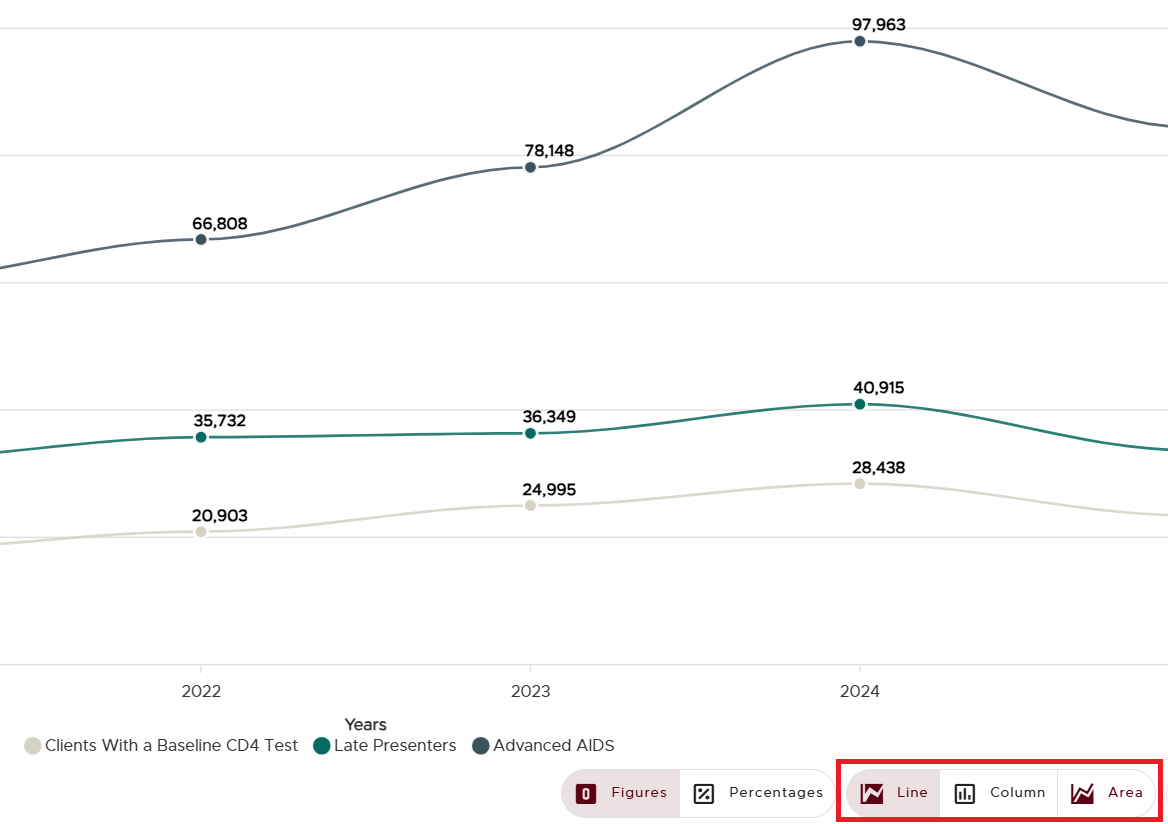
Toggle between Line, Area & Column charts
Linkage Charts
Some charts convey minimal information to convey quick insights to users at a glance. Most of these charts can be found on the Overview/Dashboard page. Such charts are characterized by a yellow arrow icon to their bottom right. Comprehensive insights can be obtained by clicking the yellow arrow icon to direct users to the more elaborate chart.
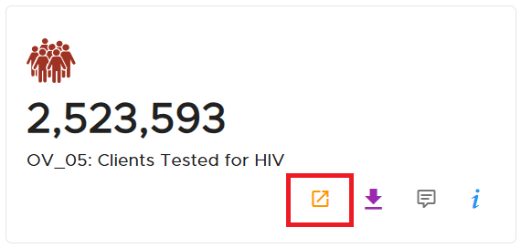
A linkage chart with the linkage icon
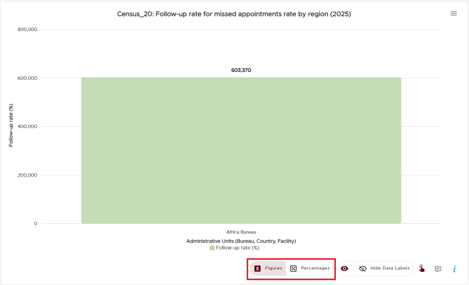
Percentages vs Figures
Some charts visualize data that can be conveyed either as figures or percentages. Such charts include a figure and percentage toggle button, permitting users to switch between the two numerical types.
A snippet depicting the figures/percentage toggle